

Are you tired of using CSS's float and position properties to make your layouts responsive? Using these properties can also be a bit frustrating and not so convenient. Thankfully there is Flexbox to make our life easier.
So let's learn Flexbox to make flexible layouts easily.

What is Flexbox?
The Flexible Box Module or Flexbox is a one-dimensional layout model that allows us to do space distribution between items and also offers us powerful alignment capabilities.
As the Flexbox is one-dimensional it deals with one dimension at a time, either as a row or as a column.
Let's Setup Some Code First
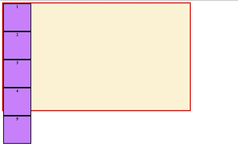
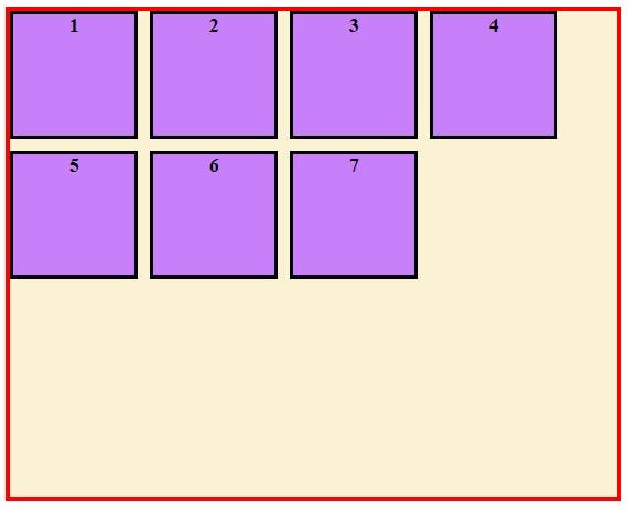
To understand the concepts of flexbox, let's first write some HTML and CSS.
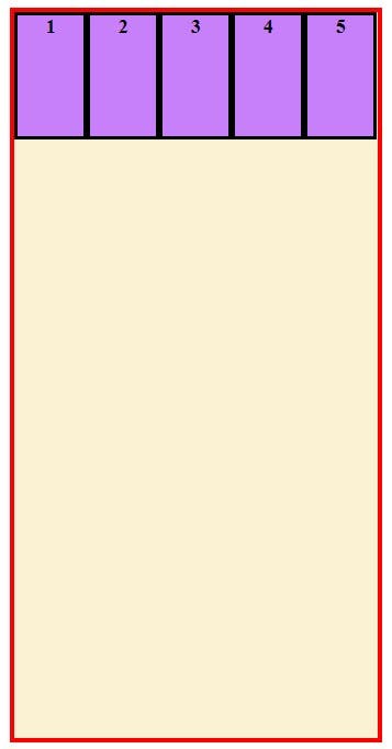
Let's make a div with the class="container" and five div with class="box" as its child
HTML:
<div class="container">
  <div class="box">1</div>
  <div class="box">2</div>
  <div class="box" id="three">3</div>
  <div class="box">4</div>
  <div class="box">5</div>
</div>
Let us style the container and div to make things easily understandable.
CSS:
/* PARENT CONTAINER */
.container{
width:700px;
height: 600px;
border:solid 4px red;
background-color: #FBF1D3;
}
/*ALL Child Div*/
.container > *{
width: 100px;
height: 100px;
background-color: #C780FA;
border: solid #000;
text-align: center;
font-weight:bold;
}
Let us see the output of the code we wrote:
OUTPUT:
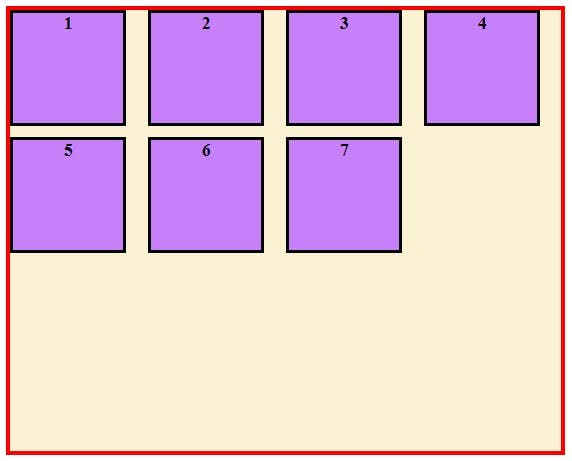
Let's make it Flexbox
To make an element behave as a flex container we need to use display property with value flex . Let us make our container div a flex container by writing the code below
.container{
display:flex;
}
OUTPUT:
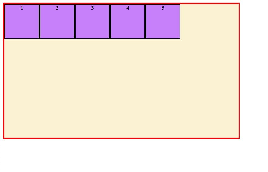
The Parent container is now a flex container and the child divs are now flex items. As you can see in the output, the children div elements are now arranged in a row, horizontally. This is happening because of a property called flex-direction and by default, it has a value of row .
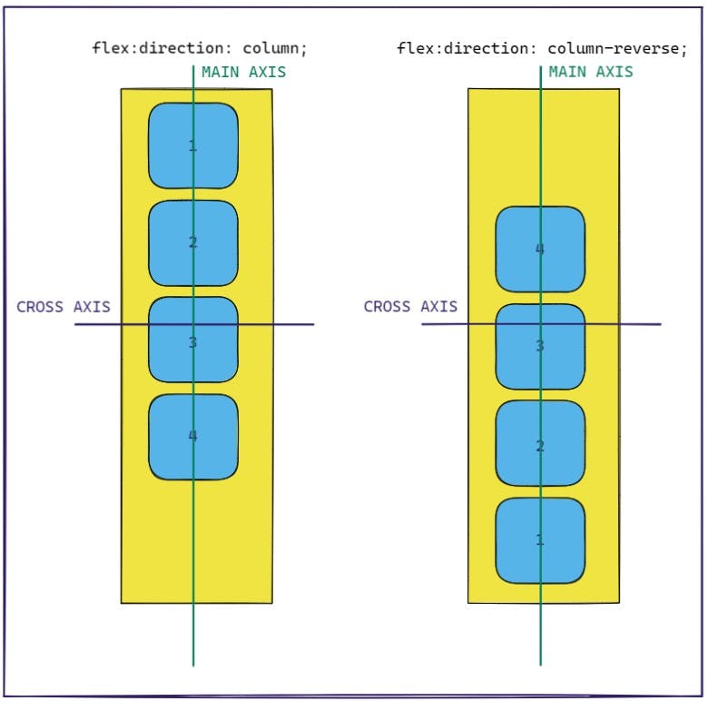
Flex-Direction
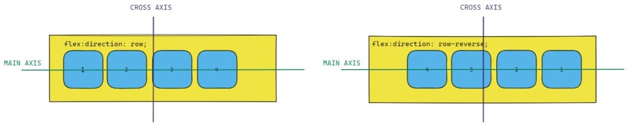
Before we learn about flex-direction, we need to know about two axes of flexbox --> the main axis and the cross axis. The main axis is defined by the value of flex-direction property and the cross-axis is perpendicular to the main-axis.
Now let's talk about the different values flex-direction property can have
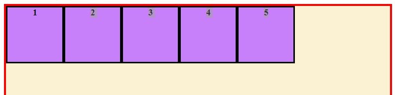
flex-direction:rowThis is the default value of flex-direction. As we saw in the example above this lays out the flex items from left to right horizontally inside the flex container.
flex-direction:row-reverseThis lays out the flex items from right to left in a row (horizontally).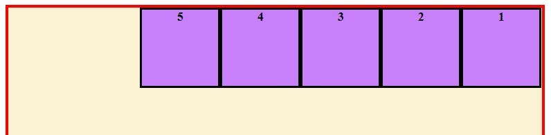
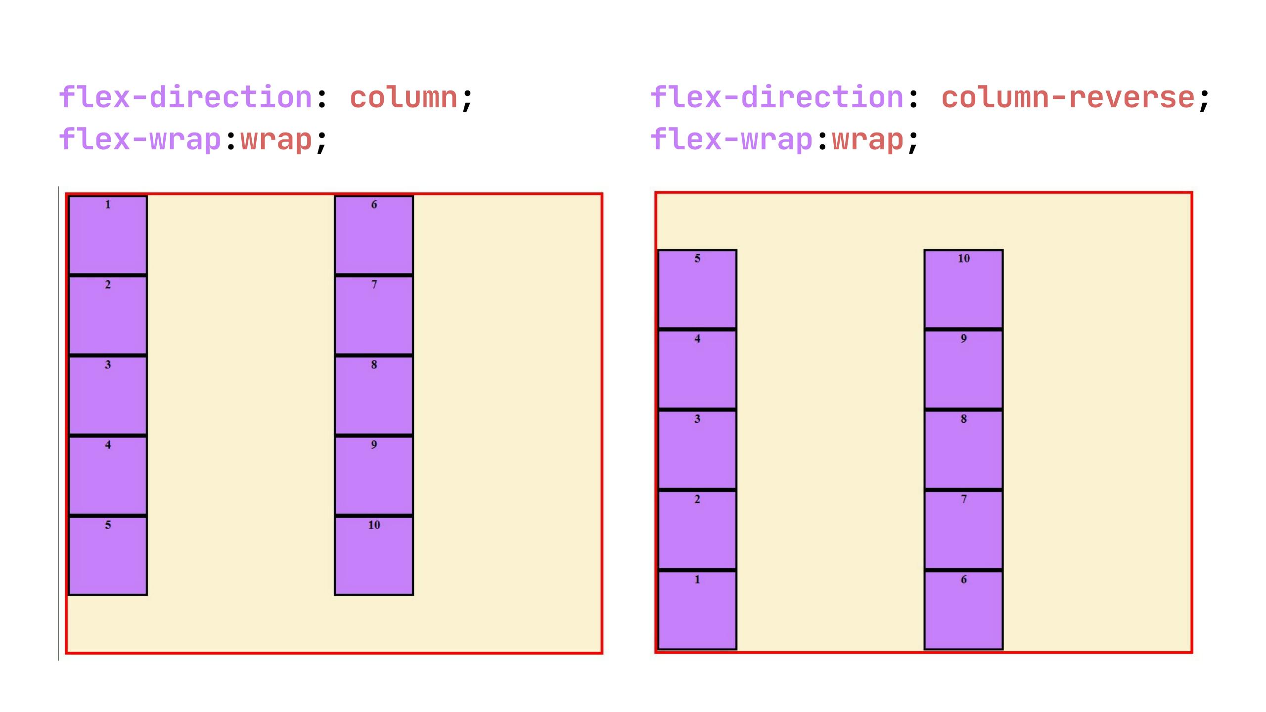
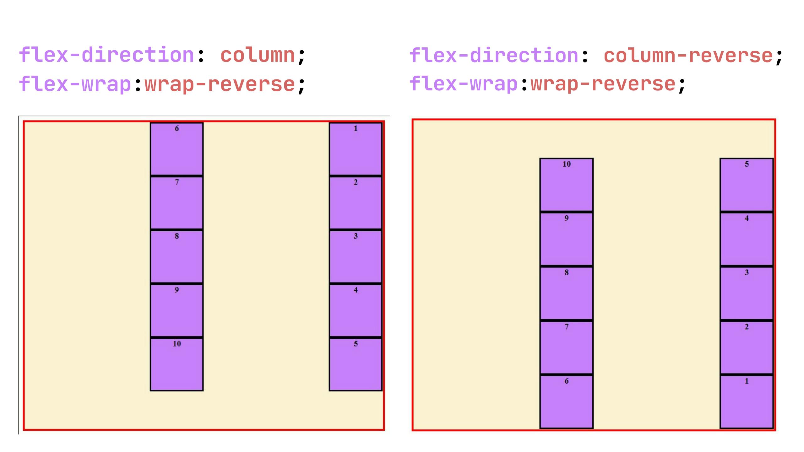
flex-direction:columnThis lays out the flex items from top to bottom vertically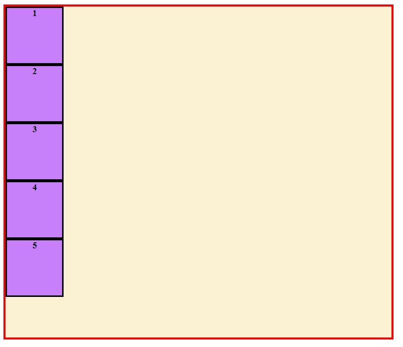
flex-direction:column-reverseThis lays out the flex items from bottom to top vertically.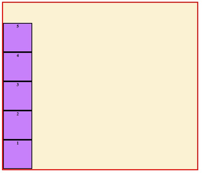
As we have seen different values of flex-direction now we can be more clear about the axes. So when the flex-direction is row or row reverse , the main axis is horizontal and the cross axis is vertical and when the flex-direction is column or column-reverse, the main axis is vertical and the cross axis is horizontal.
Multiline Flex containers
By default, flexbox tries to fit the flex items inside the single line which results in the flex items getting squeezed if there is not enough space. This can be dealt with the property known as flex-wrap . By default its value is set to nowrap that is the reason why flexbox tries to fit them in one line.
To see this we can either decrease the size of our flex container or we can add more flex items . Let's see both case:
Case 1 - Decreasing Width of Flex Container (<div class="container">) :
.container{display: flex;
flex-direction: row;
width:300px; /*DECREASED TO 300px from 700px*/
height: 600px;
border:solid 4px red;
background-color: #FBF1D3;
}
OUTPUT:
Case 2 - Adding more flex items (without decreasing width of flex container):
<div class="container">
    <div class="box">1</div>
    <div class="box">2</div>
    <div class="box">3</div>
    <div class="box">4</div>
    <div class="box">5</div>
    <div class="box">6</div>
    <div class="box">7</div>
    <div class="box">8</div>
    <div class="box">9</div>
    <div class="box">10</div>
</div>
.container{display: flex;
flex-direction: row;
width:700px; /*WIDTH IS NOT DECREASED, SAME AS STARTING*/
height: 600px;
border:solid 4px red;
background-color: #FBF1D3;
}
Output:
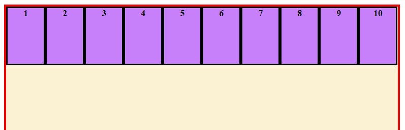
Now we've seen how flex items try to fit into a single line when the flex-wrap is set to nowrap (by default),so it's time to see what other values flex-wrap can take
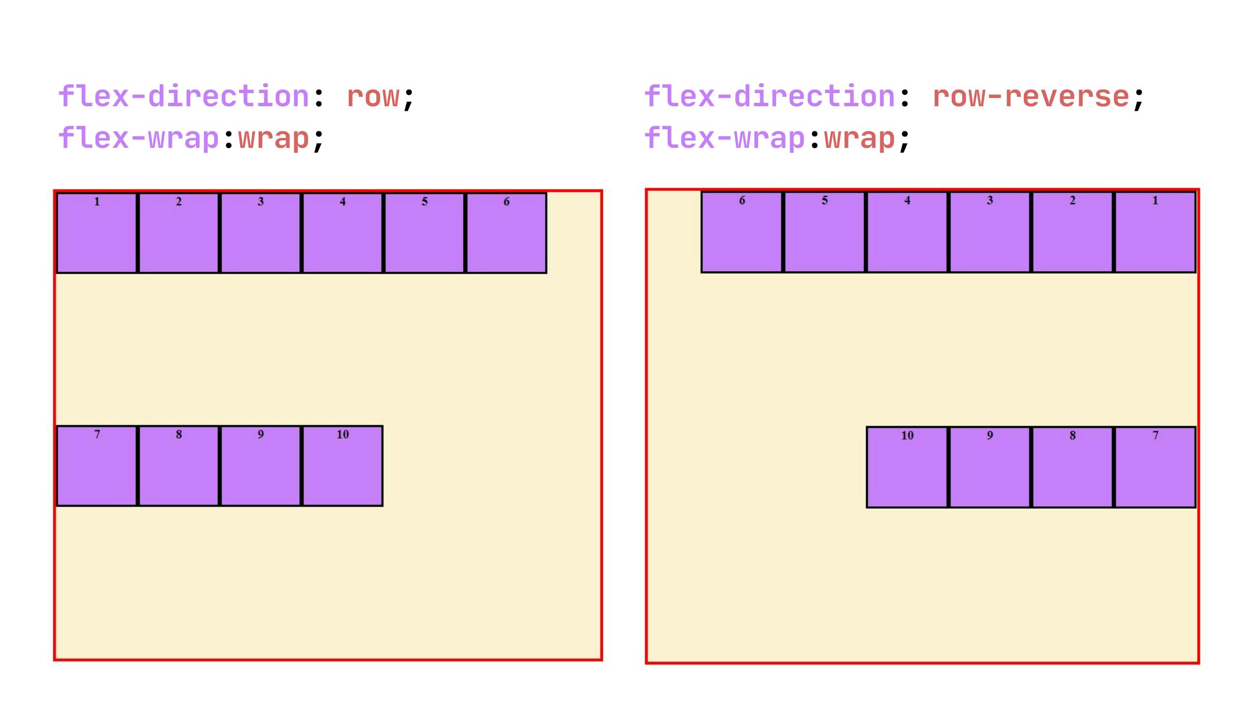
flex-wrap: wrapThis will break the flex items into multiple lines. The Direction in which new lines will be formed depends on the flex-direction property.If
flex-directionisrow/row-reverse, the lines will form from top to bottom and
forcolumn/column-reverse, lines will form from left to right.Understand it more easily with the example images below.
flex-wrap: wrap-reverseThis reverses the direction in which the flex items will be wrapped. Which means forflex-directionrow/row-reverseit will wrap from bottom to top instead oftop to bottomand
forcolumn/column-reverseit will wrap from right to left instead ofleft to right.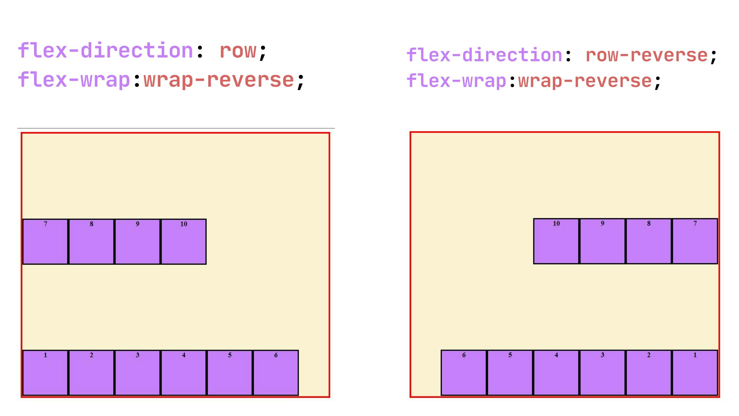
Time to align flex-items using Flexbox
Flexbox provides us flexible alignment capabilities. We can align the flex items on the main-axis using justify-content property and on the cross-axis using align-items property. These two are the majorly used properties to align the items but apart from these there are few more properties that are really helpful.
Let's see all the properties used for alignment before understanding them in detail.
justify-content- Used to align all flex items on the main-axisalign-items- Used to align all flex items on the cross-axisalign-self- Used to align an individual flex item on the cross-axisalign-content- Used only when there are more than one line of flex-items to align those lines on the cross axis.gap(shorthand forrow-gapandcolumn-gap)- used to create gap between the rows or columns or both in a flex container.
justify-content
This property is used to align flex items on the main-axis . Lets see the different values we can give to this property and how it will affect our layout.
justify-content: flex-start(by default) - This aligns the flex items packed close to each other towards the start of the flex container on the main axis. The start edge depends on the flex-direction.
Forflex-direction:rowitems will align to left of the flex container on the main axis and for row-reverse to the right of the container.Similarly for
flex-direction:columnitems will align to top of the flex container on the main axis and for column-reverse to the.container{ display: flex; flex-direction: row; justify-content:flex-start; /*Even if you don't write this is the value by DEFAULT*/ width:1000px; height: 600px; border:solid 4px red; background-color: #FBF1D3; }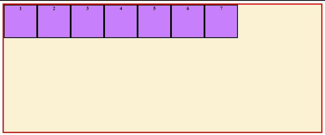
justify-content: flex-end- In this, the flex items will get pushed towards the end of the flex container on the main axis./*Only mentioning the code required to explain, check the whole code in the example above*/ .container{ display: flex; flex-direction: row; justify-content:flex-end; }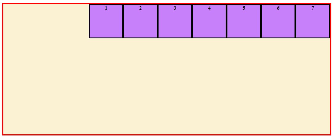
justify-content: center- This centers the flex items on the main axis..container{ display: flex; flex-direction: row; justify-content:center; }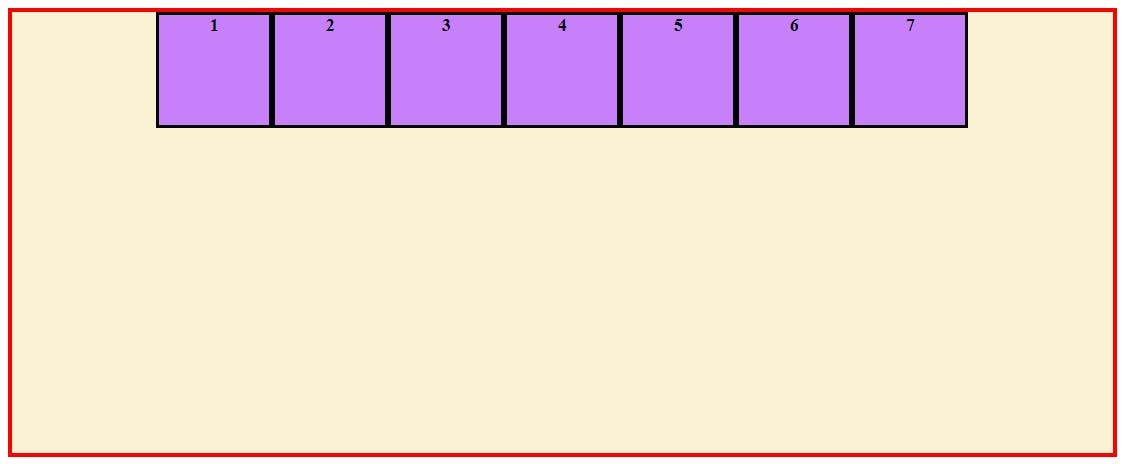
justify-content: space-between- This distributes equal space between the flex items in a line on the main axis, keep in mind the first flex item is placed at the very start of the flex container and the last flex item is placed at the very end of the flex container on the main axis..container{ display: flex; flex-direction: row; justify-content:space-between; }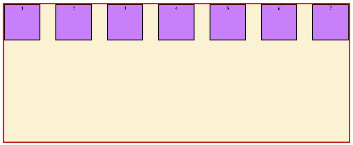
justify-content: space-around- This gives equal space around each flex item in a line on the main axis.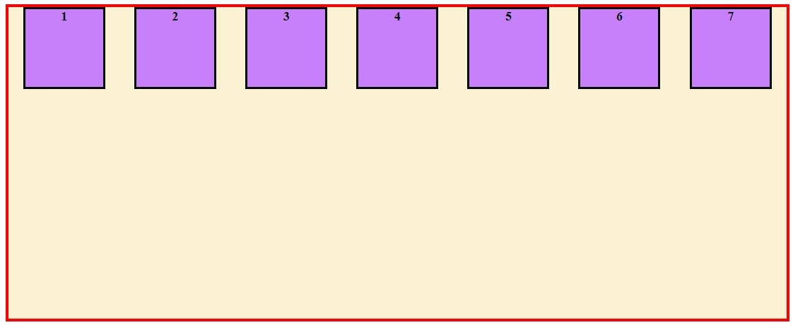
justify-content: space-evenly- This evenly distributes the space. The space between the flex items, the first item and the start edge of flex container and the last item and the end edge of the flex container on the main axis is same.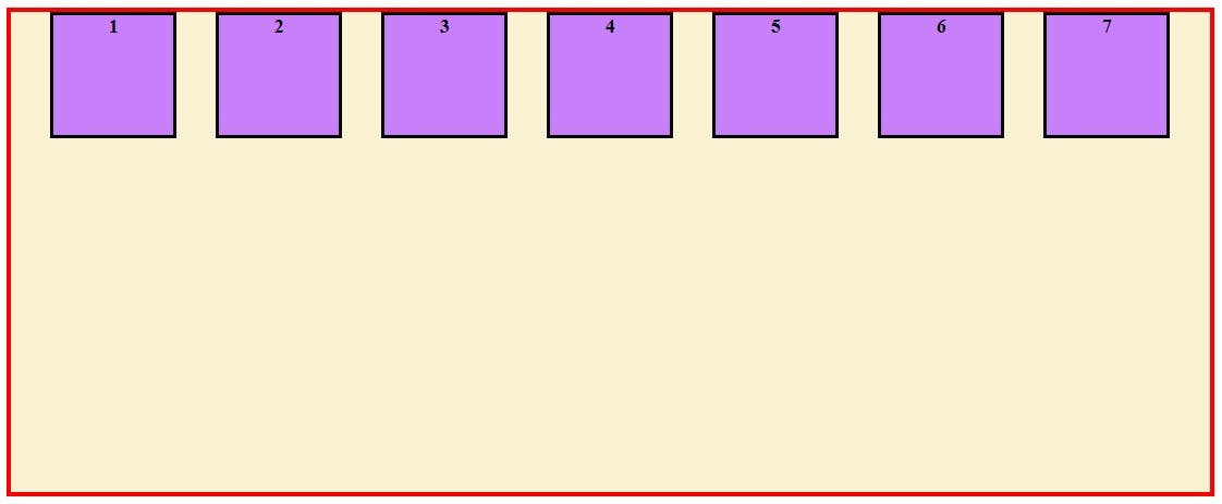
align-items
This property is used to align the flex items on the cross axis.
align-items: stretch(default) - This stretches the flex items on the cross axis to fill the container, respecting the height and width constraints if there are any.To see this in action let us remove the height from our boxes./*PARENT CONTAINER*/ .container{ width:700px; height: 600px; border:solid 4px red; background-color: #FBF1D3; display: flex; flex-direction: row; /*NOTICE we have have not written align-items property*/ } /*ALL Child Div - Boxes*/ .container > *{ width: 100px; /*height: 100px; Height removed of the boxes */ background-color: #C780FA; border: solid #000; text-align: center; font-weight:bold; }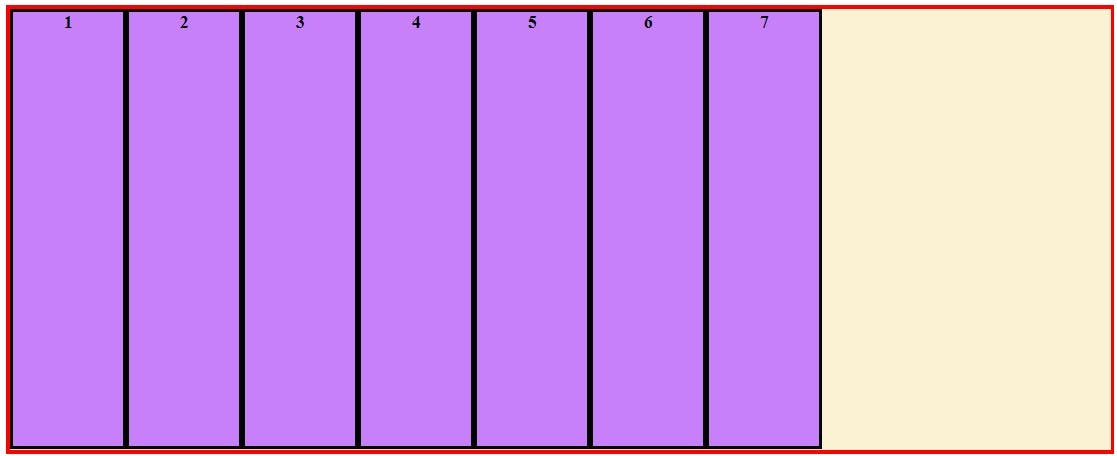
As you can see without the height constraint the flex items stretched to fill the full height of 600px of the flex container. This is happened because of
align-items:stretchLet us again give out flex items their height of 100px back to see the other values of align-items in effect
align-items: flex-end- This aligns the flex-items to the end of the cross axis line.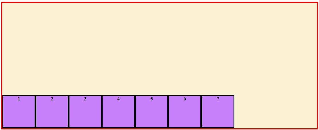
align-items: center- This centers the flex-items in the cross axis.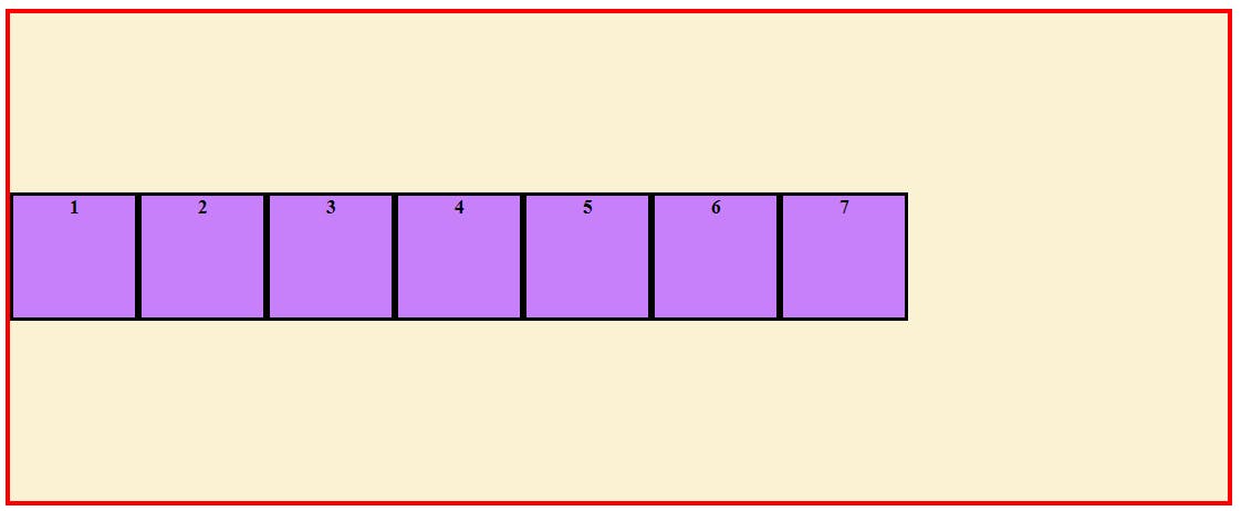
We can give both
align-items:centerandjustify-content:centertogether to perfectly center the items inside flex container. See the output below.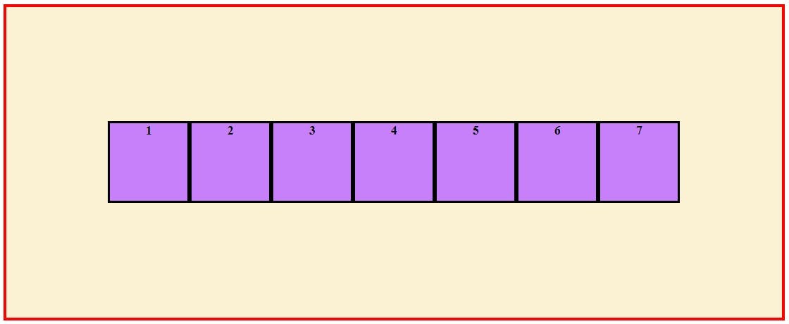
align-items: flex-start- This is used to align the flex items to the start of the cross axis.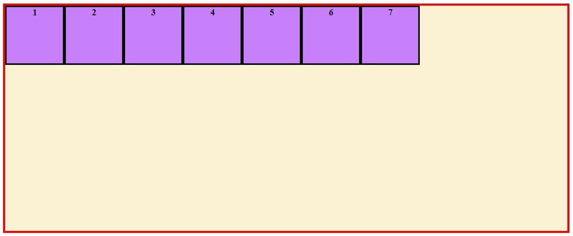
align-self
This property is used to align an individual flex item on the cross axis.
Let us target our third box (id="three") to see the effect of this property.
align-self: flex-start- This aligns the targeted flex item to the start of the cross axis. To see this in effect lets givealign-items:centerto center all flex items on the cross axis and then givealign-self:flex-startto the box with id = "three"..container{ display: flex; flex-direction: row; align-items: center; } #three{ align-self:flex-start; }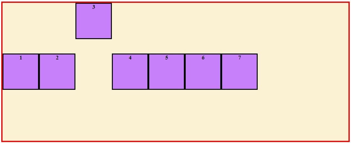
align-self: flex-end- This aligns the flex item to the end of the cross axis.#three{ align-self:flex-end; }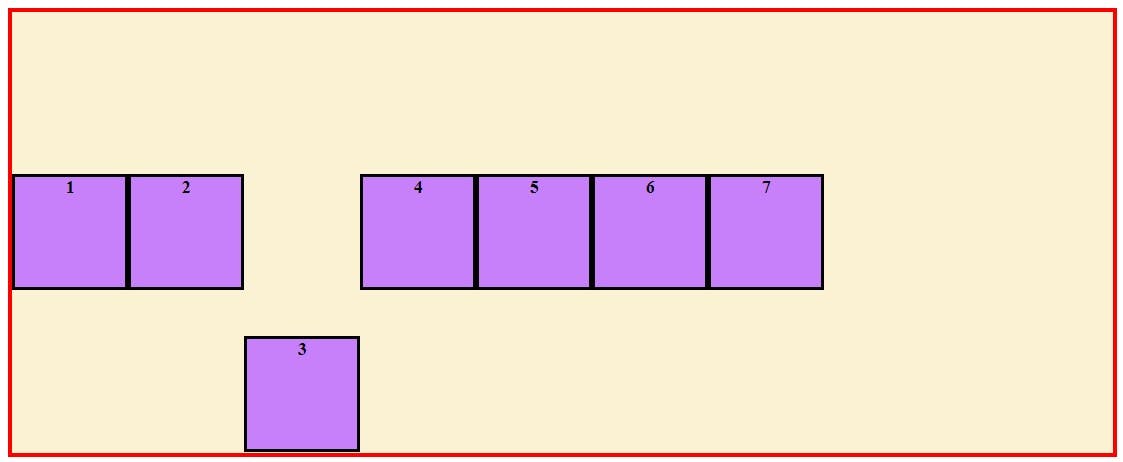
align-self: center- This centers the flex item on the cross axis. To see this effect let's remove thealign-item:centerproperty from the container to make the items go to start..container{ display: flex; flex-direction: row; } #three{ align-self:center; }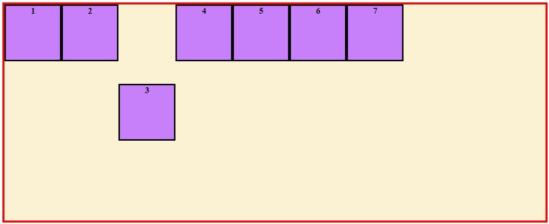
align-self: stretch- This stretches the flex item to fill the cross axis space. As we have given a fixed height of 100px to our boxes let's remove the height from the third box to see this in effect.#three{ height:unset; align-self:center; }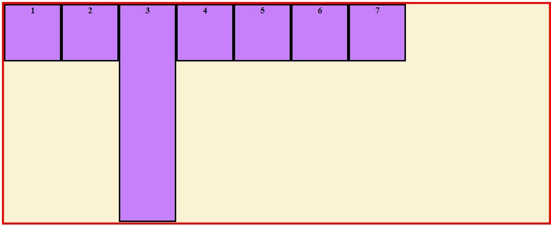
align-content
This property only works when there are more than one line in the flex container on the cross axis. This is used to align the flex container's lines when there is extra space in the cross axis.
Just like how justify-content works to align items on the main-axis, the same way align-content aligns lines on the cross-axis.
Lets decrease the width of the flex container and give flex-wrap:wrap to have the flex items wrap to create more lines.
align-content: flex-start- This pushes the lines of flex items to the start edge of the flex container on the cross axis.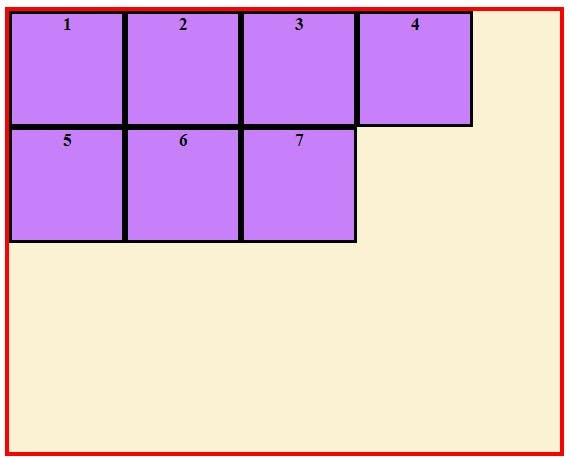
align-content: flex-end- This pushes the lines of flex items to the end edge of the flex container on the cross axis.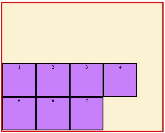
align-content: center- This centers the lines of flex items on the cross axis.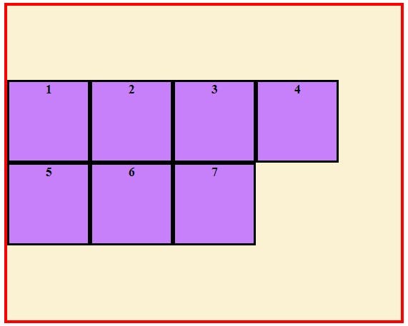
align-content: space-between- This distributes equal space on the cross axis between the lines of flex items. The first line is to the very start edge of cross axis and the last line is to the very end.
align-content: space-around- This distributes equal space around each line on the cross axis. As the space is around each line, the space between the lines will be twice the space between the start edge of the container and the first line and the end edge of the container and the last line.
align-content: space-evenly- This evenly distributes equal space along the cross axis. The space between the lines,the start edge and the first line and the end edge and the last line is exactly same.
gap
You can use this property to create gap or gutter between the rows and columns of a flex container. It is a shorthand for row-gap and column-gap property.
If you give one value to it, it will act as value for both row-gap and column gap and if you give it two values the first value will act as row-gap and the second as column-gap.
.container{display: flex;
flex-direction: row;
flex-wrap:wrap;
align-content:flex-start;
gap:10px; /*10px will be both the row-gap and the column-gap*/
}
.container{display: flex;
flex-direction: row;
flex-wrap:wrap;
align-content:flex-start;
gap:10px 20px; /*10px will be the row-gap and 20px will be the column-gap*/
}
order
As the name suggest you can use order property for ordering the flex item. The default value of order for each flex item is 0. You can give negative or positive value and according to that the order in which they appear will change.
Lets give third box order of -1 , second box order of 3 and fifth box order of 4.
#three{
order:-1;
}
#two{
order:3;
}
#five{
order:5;
}
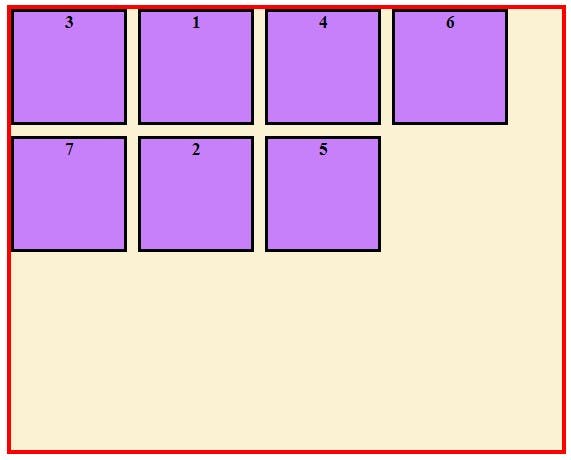
Now as you can see the third box(order:-1) is now at the first and the second box(order:3) is now at second last and fifth box(order:4) at last.
Keep in mind the default order value for all flex items is 0.

Wow this took a lot of time to write 😅, I hope you sticked with me till here. If you did I know you will be now way more Flexible in designing those cool layouts with CSS 😎.
If you have any feedback for me do share them as comments and do drop a like if you liked the article. Until next time, Have a great One ahead!! 😄