


If you are new to HTML, when you go to a website and enter your email id and password in different fields, have you ever thought about how are those fields created using HTML?
Those fields are created using the input element. Not only are there many variations of input element that you might be using in your daily usage of the internet but you don't know that those are also made using input element. So Let's get to know <input/> element in detail.
Intro
Input Element provides interactive controls to the user. It is used to accept data from the user. Input Element contains various combinations of types and attributes which we are going to see in 3...2...1!

Input Types
The input element contains a type attribute and its functionalities can vary depending on the value you provide to this attribute. We'll talk about the different input types in a moment but before that keep in mind that if you don't specify a value to the type attribute then the input element is rendered as input with type="text"
!! Another important thing to know is that if you want an input that is mandatory then you can use required attribute. It is a boolean attribute so you can just write it as it it is without any value and that would mean that the user can't skip that input field.
!! <input type="text" required />
type="text"
As we just saw, input of text type is the default version of input which gets rendered if there is no type defined. It creates a text field in which the user can enter text. These text fields are single-line.
<h2>Text Type Input - with attibutes (Try entering more than 8 characters)</h2>
<input type="text" minlength="5" maxlength="8" size="30" placeholder="Enter text"/>
<h2>Text Type Input</h2>
<input type="text" />
There are some important attributes that can be useful while using text type input. Those are:
minlength
Using this attribute you can specify a minimum number of characters that the user must enter in thetextinput. The value of this attribute must be a non-zero integer that can be smaller than or equal to the value ofmaxlengthattribute.example:
<input minlength="5" />maxlength
Use this attribute to specify the maximum number of characters the user can enter in thetextinput.example:
<input maxlength="8" />placeholderAs the name suggests,
placeholderattribute is used to show a temporary text in the input field until the user enters any text. It is used to give hint to the user about what is expected to be entered in the text input.Rather than being a long text, the value of this attribute should be a short phrase or a word.
sizeThis attribute is used to define the size of the text input. It defines how many characters wide the input field should be.
The default value is 20
type = "button"
This value of the type attribute is used to render the input element as a push button. The input elements with type="buttons" contains no functionality. If you want it to behave in a particular way then you have to write javascript code for it.
<h1>Button with no value attribute</h1>
<input type="button" >
<h1>Button with value attribute</h1>
<input type="button" value="I am a Button">
There's an important attribute that you would want to use when using the button input element and that is value attribute. The value you give to this value attribute will be shown as the text inside the button, without this attribute your button will get empty without any text. See the example above 🆙
Although using <input type="button"> is totally valid if you want to get a button but the favoured way is to use the <button></button> element provided by HTML. You can also insert images in your button if you use <button></button> element as the text is inserted between the opening and closing tag.
type = "checkbox"
Input of checkbox type renders a small box that is ticked (checked) when clicked.
<h2>Select all that applies</h2>

<p>Option 1</p>
<input type="checkbox" />
<p>Option 2</p>
<input type="checkbox" />
<p>Option 3</p>
<input type="checkbox" />
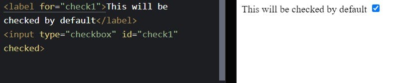
You can link the checkbox with a label element so that you can also select the checkbox by clicking on the label. Give the checkbox type input an id and then enter the name of that id as the value of for attribute in the label. Then you can select that checkbox by clicking on the label. Try it in the window below.
<label for="check1"> You can also click me to select the checkbox below</label>
<input id="check1" type="checkbox"/>
Some useful attributes that can be used with input of type checkbox :
checkedThis is a boolean attribute, which if written in the input element can make the checkbox ticked by default when the page loads.
type="file"
This input type lets the user choose one or more files from their device. Once selected the files can be uploaded using form submission or you can manipulate them with javascript code.

accept
This attribute is used to define what file types the input can accept. There's a specific way to define that, you can read about it more here.Example: This input will only accept pdf files
<input type="file" accept=".pdf">multipleThis is a boolean attribute, writing this allows the user to enter multiple files.
<input type="file" accept=".pdf" multiple>
Read More About Unique file type specifiers << Here.
type="color"
This tpe of input provides user an interface in which the user can specify a color. The interface depends on the browser or the platform user is using, depending on it the presentation can vary.
<h2>Choose your favorite Color</h2>
<input type="color">
type="password"
The input of type password provides the user with a secure way to input the password. This type of input replaces the characters of the user's password with a symbol, usually * (asterisk) or • ( dot )
<label for="user-password">
  <h1>Enter a password below</h1>
</label>
<input type="password" id="user-password">
You can also use the attributes such as minlength, maxlength, size, placeholder that we saw previously.
type="search"
The input of type search is used when you want to provide users with a text field where they can enter their search queries. It is similar to input of type text in terms of functionalities although different user browsers may style them differently.
<h1>Type your search query below</h1>
<input type="search">
type="range"
This provides a slider that can be used to select a numeric value. The value must not be less than the value of min attribute (minimum) and must not be more than the value of max attribute (maximum). This input element should be used where the precise value is not important as this element is imprecise.
<h1>Set the Volume</h1>
<input type="range" id="volume" min="0" max="50">
<label for="volume">Volume</label>
type="radio"
input Element of type radio is used when you want to provide the user with a group of related options from which the user can choose only one.
Typically the browser renders this input type as small circles which get highlighted/ filled when clicked/selected.
To make the group of radio buttons in such a way that the user can select only one from the related group, then give them all the same value for the name attribute.
Click on HTML button below to see the HTML Code.
type="hidden"
This input type is used when you want some data to get submitted with the form but you don't want the user to see that. Enter the data you want to hide as the value of value attribute
<input type="hidden" value="SomeImportantData" />
So these were some of the types of input elements. There are few more that you can read about. Go to THIS LINK if you are interested to learn more about them.
I would be really grateful if you can share your feedback with me regarding this article.
Do give it a like if it helped you in any way.
Have a Great One :)